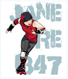
A friend of mine pointed out not just a slight rip on one of my designs but a complete rip of an illustration I did. You might recall this illustration I did back in 2009/2010 as an exercise in Adobe Illustrator.
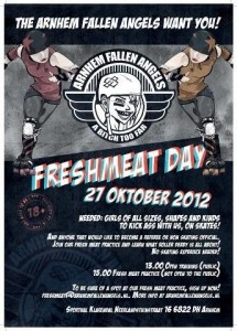
Well, it turns out that a roller derby league in the Netherlands decided that they liked it, so they altered it and used it for a fresh meat recruitment poster. The Arnhem Fallen Angels are a flat track derby league that looks brand new from all accounts.
I don’t think this really bothers me, since derby is pretty darn DIY, and it really wasn’t an image I’d intended to do anything with. But here are a few things:
- They altered the color of the skater but didn’t remove the NRG skull logo from the uniform.
- Anyone who knows Jane Ire will look at the image and say “that’s Jane Ire of NRG”. She has a distinctive way of skating and an even more distinct set of knee pads.
- They didn’t ask.
Just ask folks. If I say “no”, then it’s because I have my reasons. If I say “yes”, be prepared to ship me a t-shirt.


Comments are closed.